The select field is a field for inputting one or more values selected from predefined options set in the management screen.
It is suitable for categorizing and attributing data from fixed options, such as product size variations (S/M/L) or prefectures.

If "Multiple Selection" is set to OFF in the schema settings, it will be displayed in a dropdown format.

If "Multiple Selection" is set to ON in the schema settings, it will be displayed in a checkbox format.
Please refer to the following documents for submission using API and CSV.
Settings Item | Description |
|---|---|
Required Field | When set to ON, input is required during submission. |
Description | This is the description displayed on the submission screen. |
Options | You can add, edit, or delete options. |
Multiple Selection | This setting determines whether multiple selections are allowed. It can only be set when creating a new item and cannot be changed later. |
Default Value | You can specify which item should be selected by default when creating new content. |
Please refer to the documentation below for details.
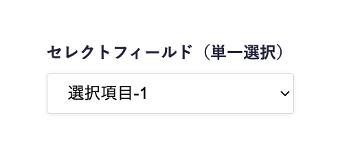
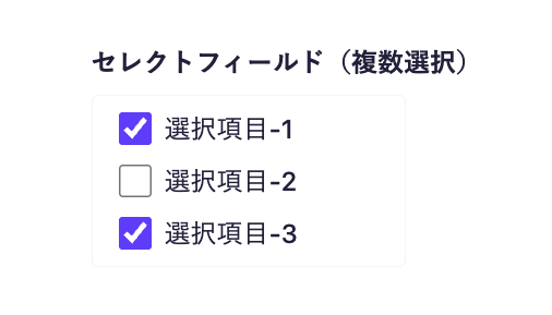
The select field is always retrieved as an array, regardless of the multiple selection setting, so in the frontend implementation, a loop is used to display the selected items.
Below is an implementation example using Next.js.
export default async function Page({ params }) {
const { slug } = await params;
// Fetch data using the microCMS JavaScript SDK (https://github.com/microcmsio/microcms-js-sdk)
const data = await client.getListDetail({
endpoint: "blog",
contentId: slug,
});
return (
<main>
{/* selectField is the field ID. Please replace it with the actual field ID */}
{data.selectField.map((tag, index) => (
<span key={index}>{tag}</span>
))}
</main>
);
}